Brand Guideline
01 Introduction
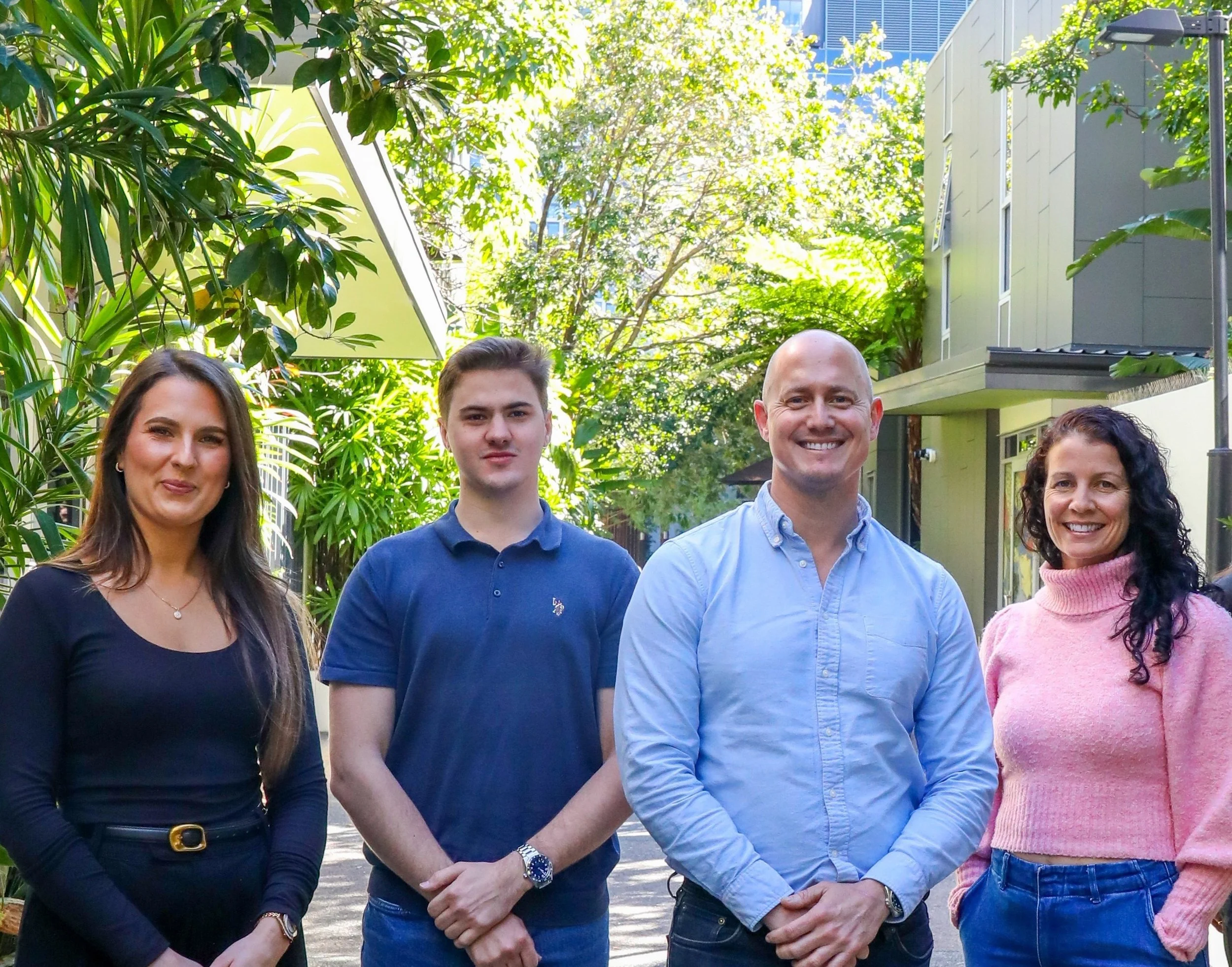
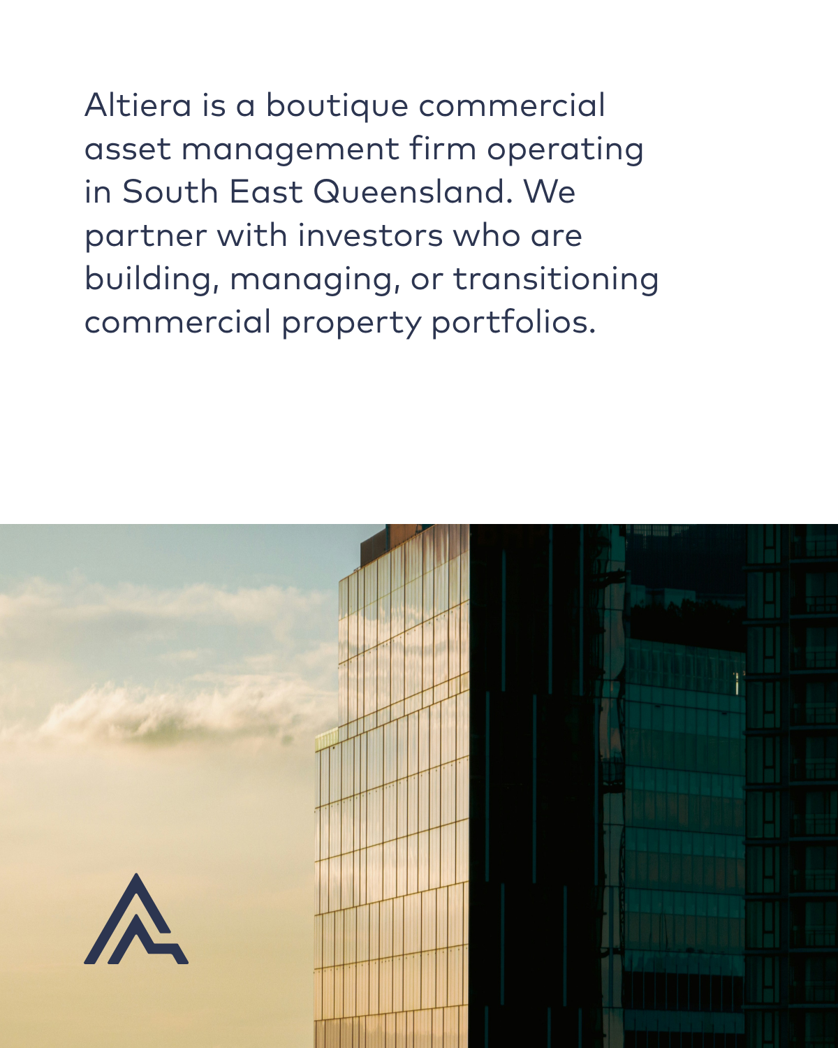
Altiera is a boutique commercial asset management firm operating in South East Queensland. We partner with investors who are building, managing, or transitioning commercial property portfolios — and who expect the people looking after their assets to think like owners, to add value and to execute on long term strategic goals.
02 Logo
Our logo is a stylised 'A' that embodies growth and partnership, standing alone as an icon or paired with the wordmark — horizontally or stacked — as needed.

03 Colour
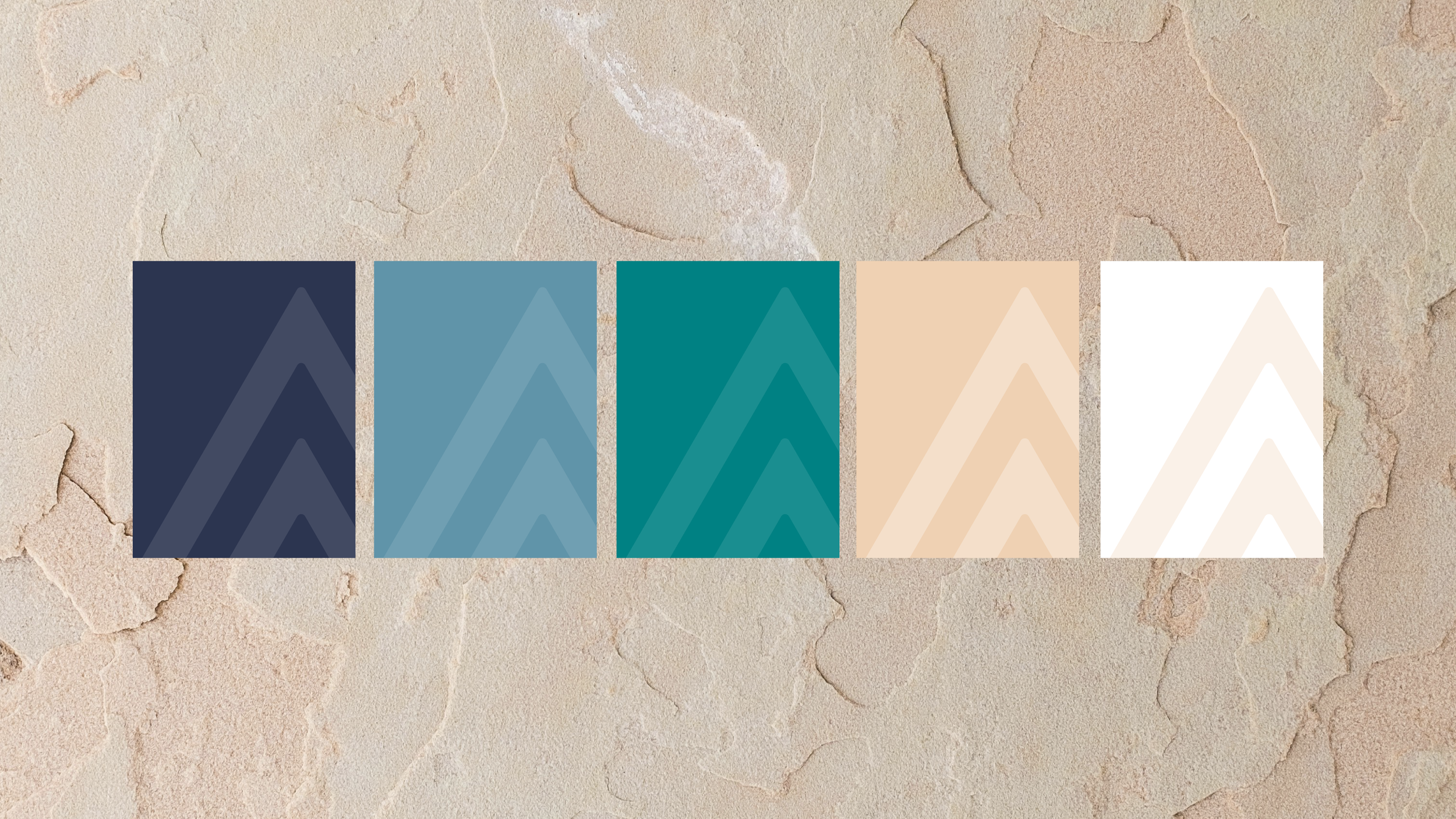
Our colour palette is calm and elegant by design, drawing on the natural hues of South East Queensland's water and landscapes to reflect our roots in the region.
Green
#008083
Light Blue
#6094A9
Sand
#EBD3B8
Navy
#2C3550
04 Typography
Our typeface is FF Mark, used across two contrasting weights for its simplicity, clarity, and technical quality.
Headings
FF Mark Medium
Paragraphs
FF Mark Regular
05 Photography

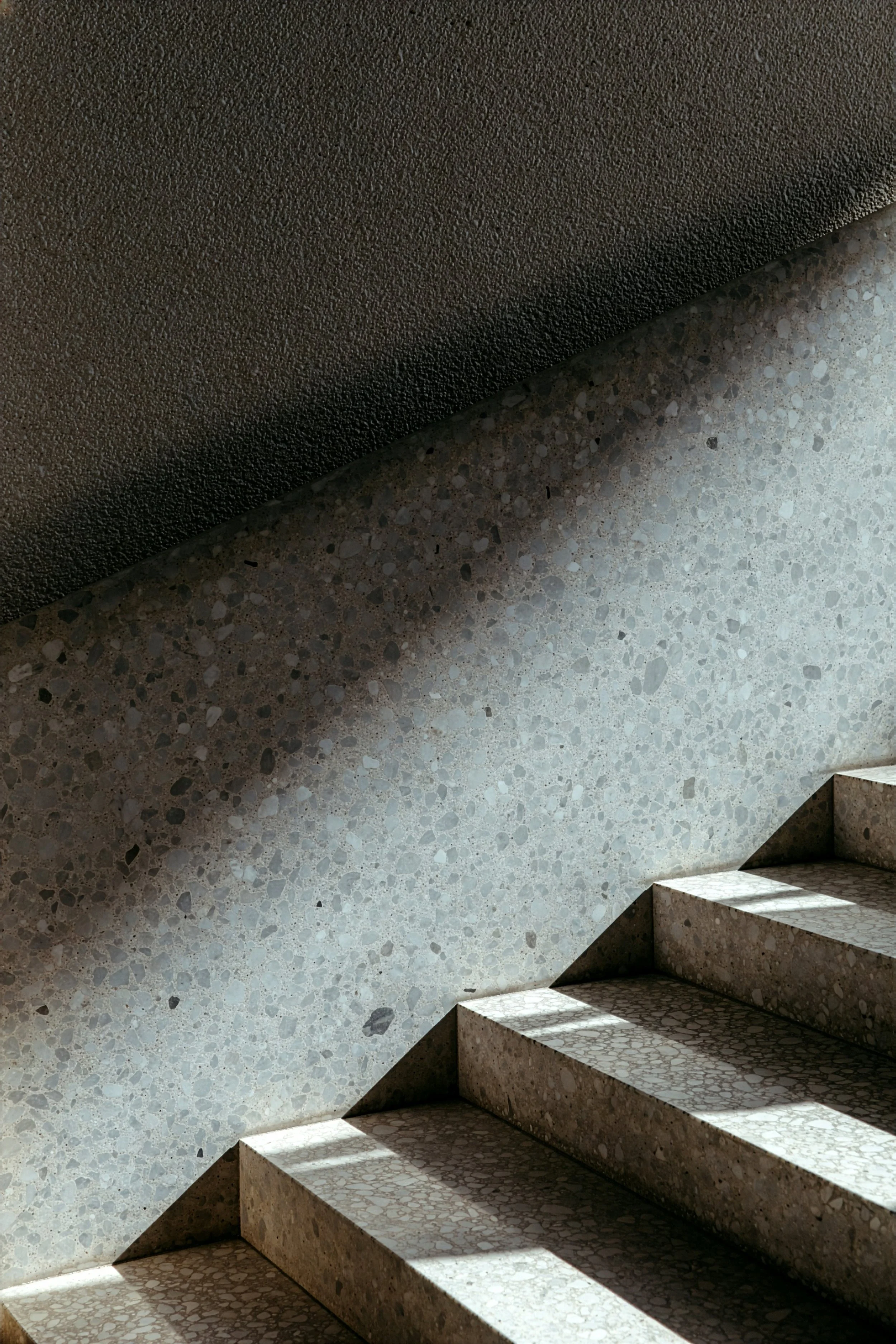
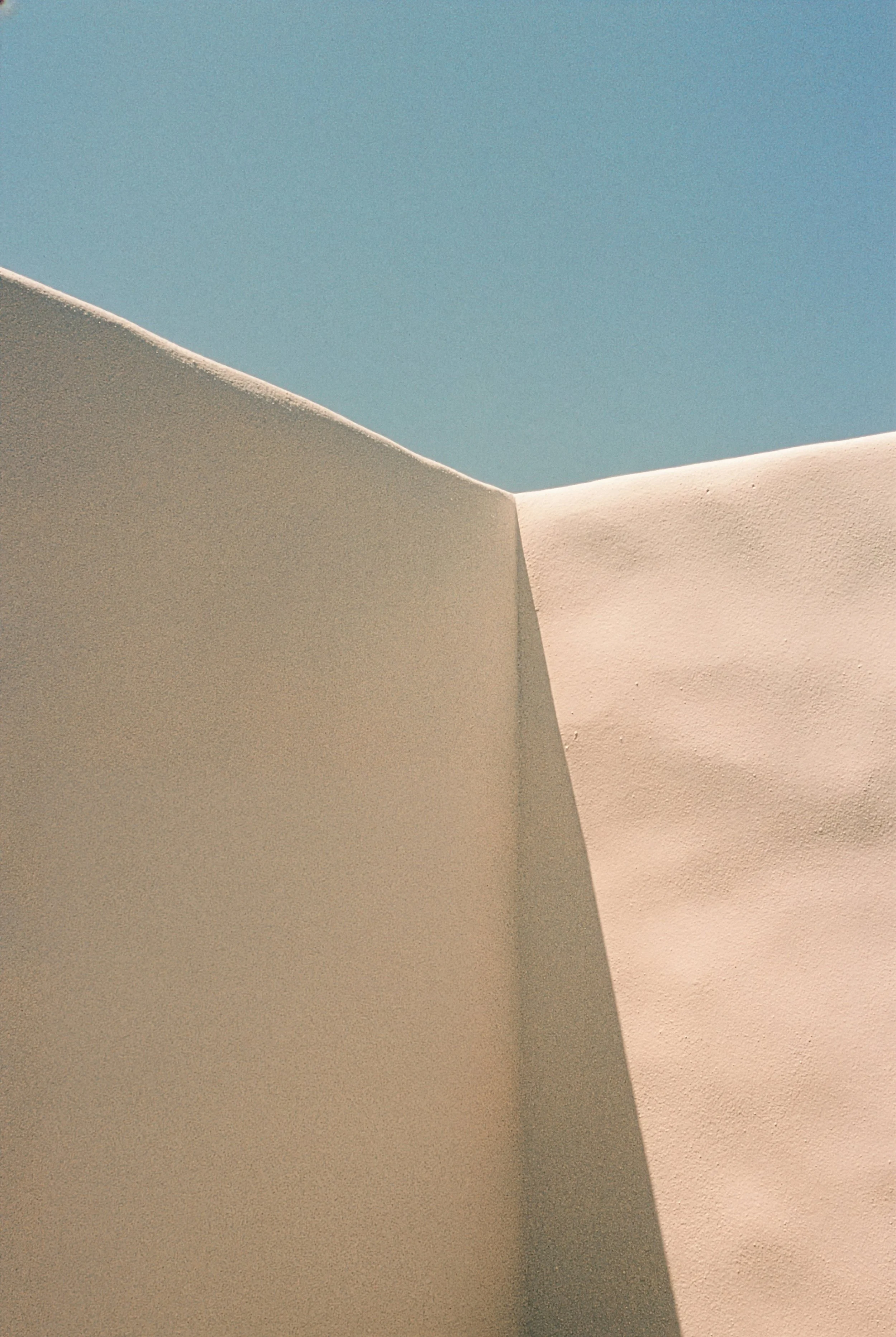

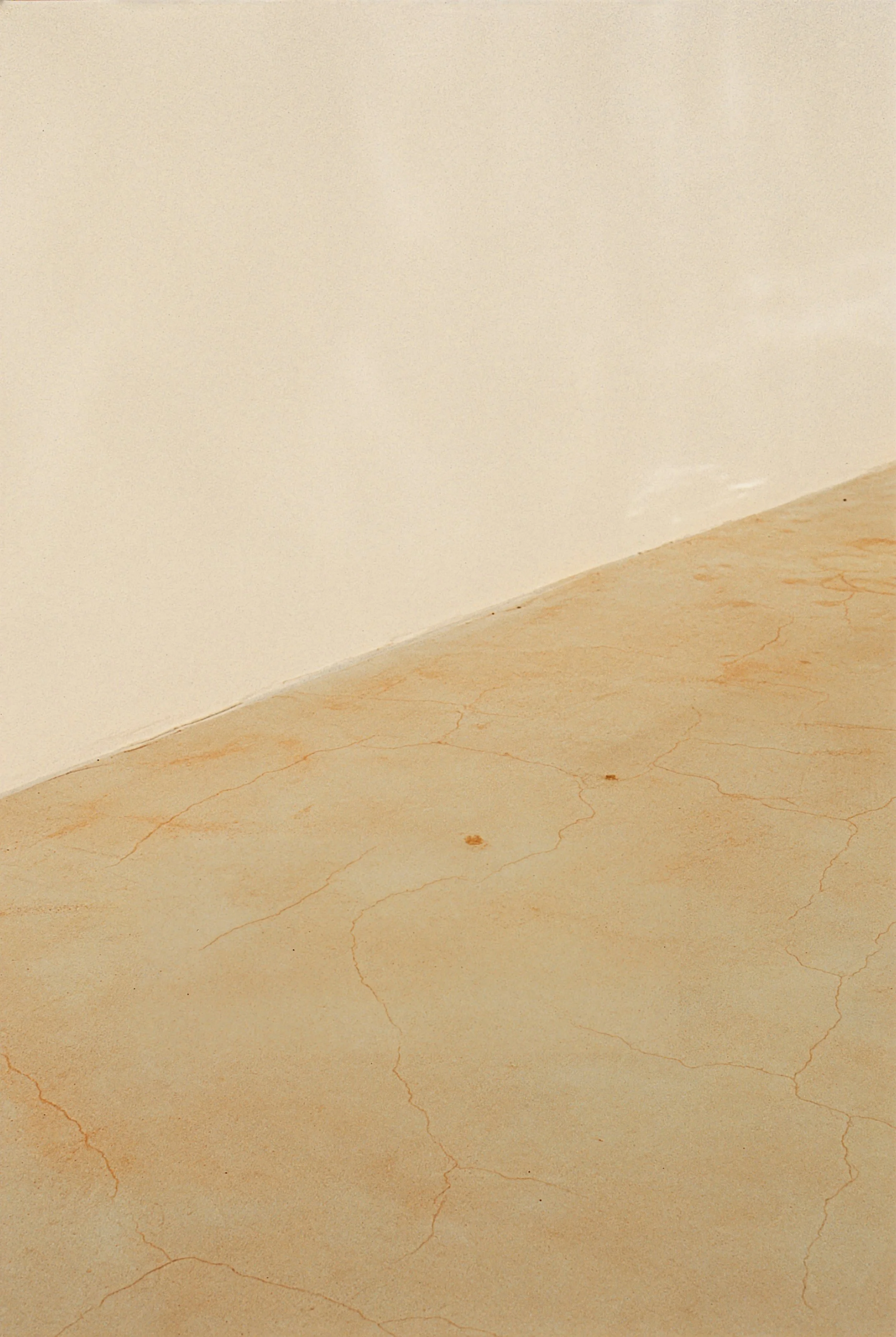
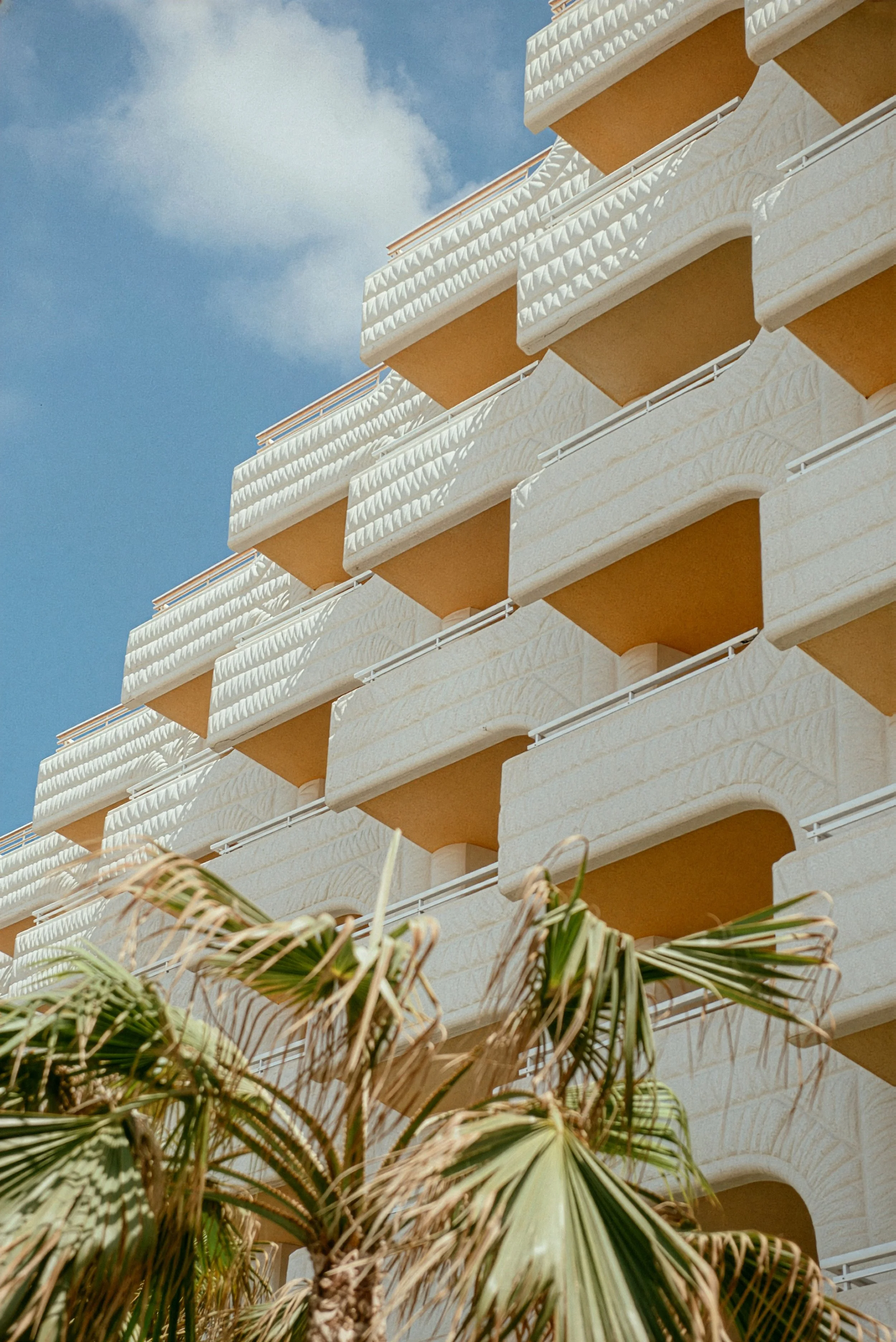
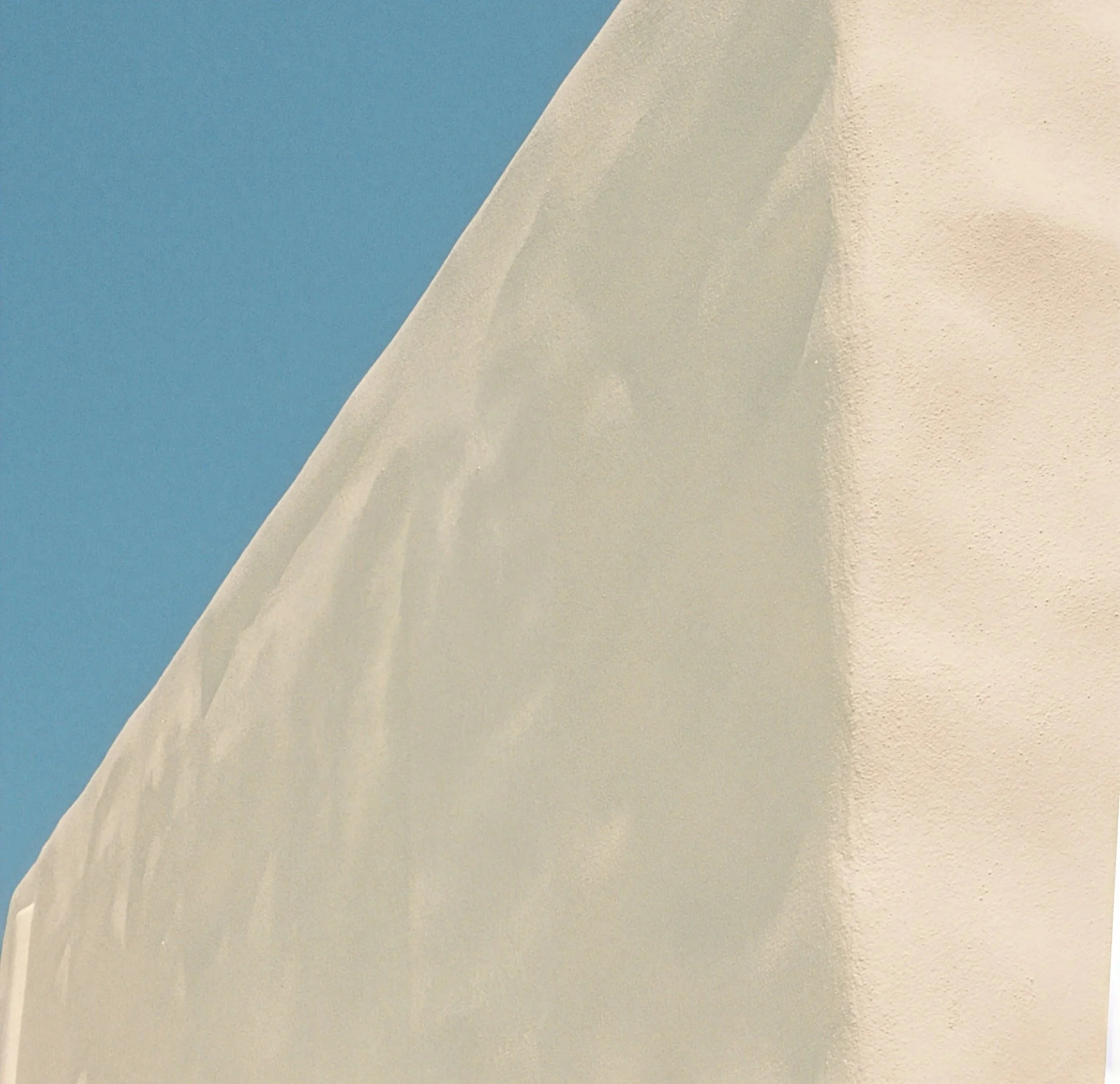
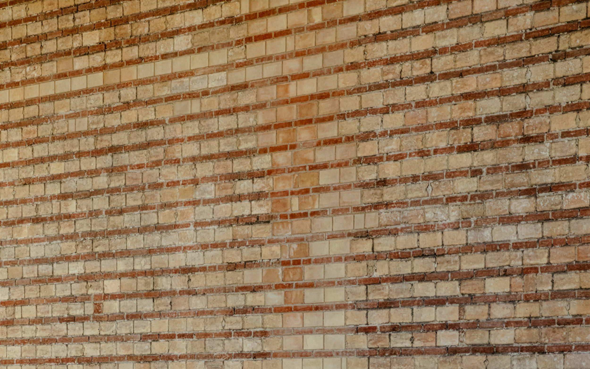

Our photography favours calm, considered compositions — warm sandy tones, soft architectural light and shadow, and the lush greens of the natural landscape — with a recurring use of strong angles that echo the geometry of our logo, reflecting a mood that is quietly confident and grounded in place.
06 Application

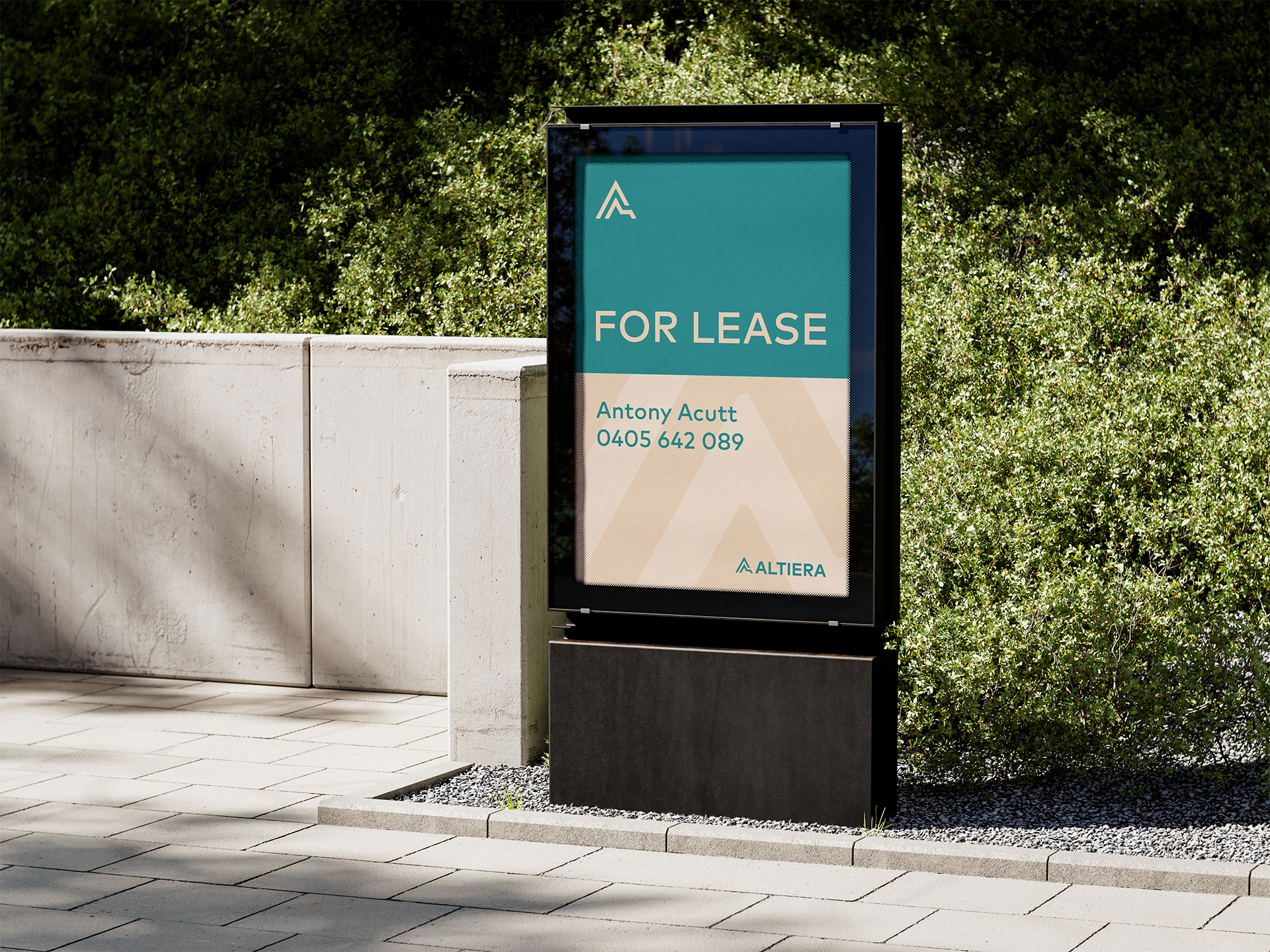
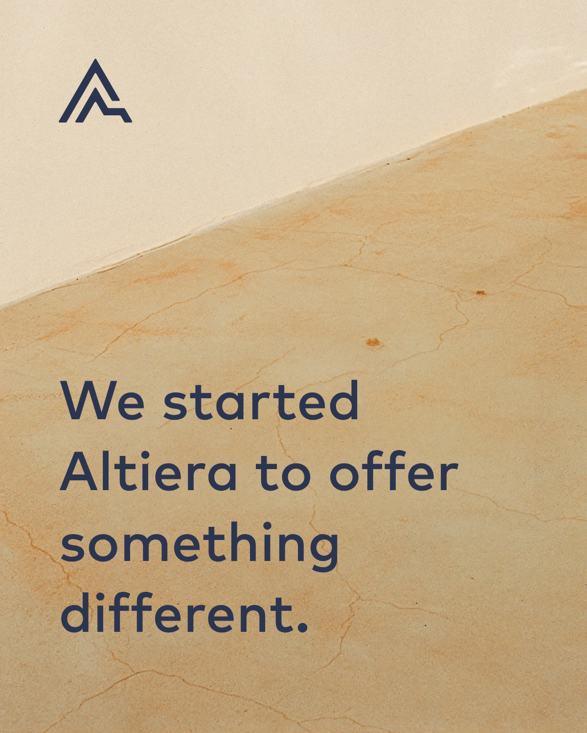


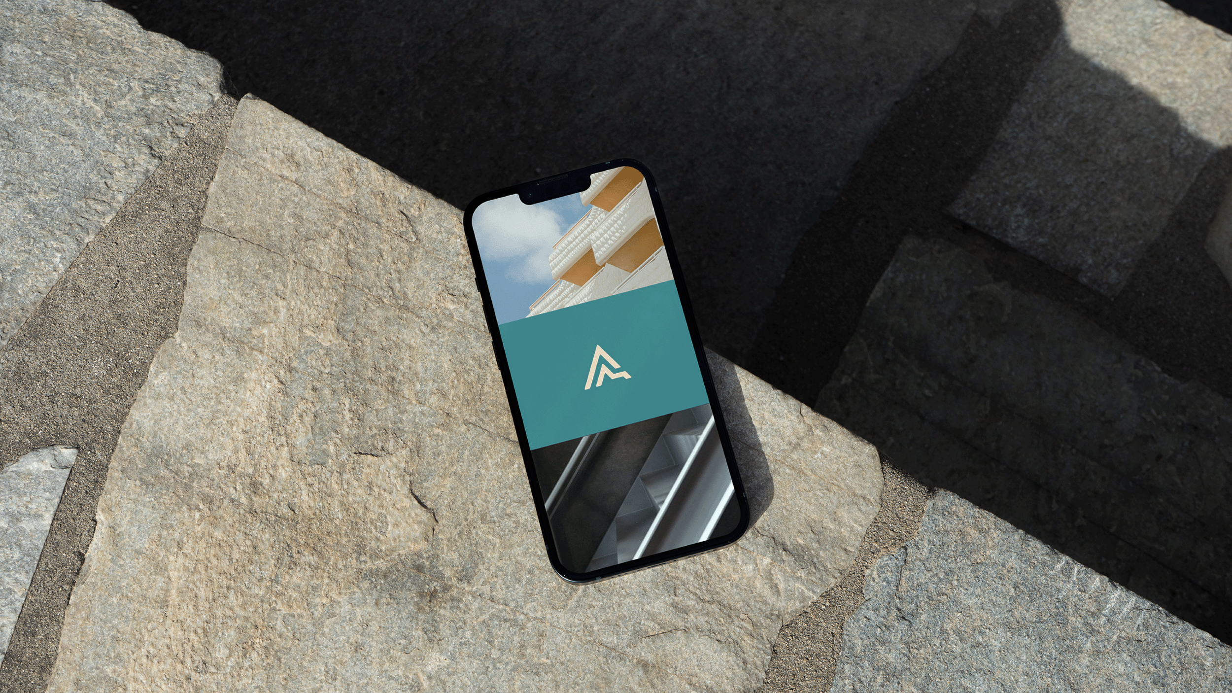
Across every touchpoint — from signage and merchandise to digital screens — the Altiera brand carries quiet confidence. By combining deep greens and warm neutrals, considered typography, and geometric mark we create a visual language that feels professional, approachable, and enduring.